A technical dictionary of printmaking, André Béguin.
Table black etching inks
Name |
colour |
covering power |
consistency |
aquatint |
dry point coarse etching |
plate tone |
wiping warm/cold |
show trough |
price ratio | |
CHARBONNEL | ||||||||||
Noir 55981 |
neutral |
**** |
buttery smoothy |
**** |
* |
little |
both |
much |
100 | |
Noir 55985 |
blue |
*** |
stringy stiff |
*** |
**** |
little |
warm |
fairly |
100 | |
Noir F 66 |
neutral |
**** |
buttery stiff |
**** |
**** |
little |
warm |
fairly |
82 | |
Noir 71303 |
brown |
*** |
stringy smoothy |
*** |
*** |
little |
both |
fairly |
100 | |
Noir luxe C |
blue |
** |
stringy smoothy |
*** |
*** |
little |
both |
fairly |
100 | |
Noir RSR |
neutral |
* |
buttery stiff |
*** |
***** |
variable |
both |
fairly |
82 | |
GRAPHIC CHEMICAL & INK COMPANY | ||||||||||
Blue black 327 |
blue |
** |
less stringy and smoothy |
** |
**** |
variable |
both |
no |
60 | |
Vine black 1014 |
brown |
*** |
less stringy and smoothy |
**** |
**** |
variable |
both |
much |
71 | |
Intense black 1797 |
brown |
**** |
less stringy stiff |
*** |
***** |
variable |
both |
no |
88 | |
Black 514 |
blue |
* |
less stringy stiff |
*** |
**** |
little |
both |
no |
60 | |
Stiff black 135S |
blue |
* |
stringy very stiff |
* |
***** |
little |
cold |
much |
68 | |
FAUST | ||||||||||
Warm black |
brown |
*** |
buttery very smoothy |
*** |
** |
much |
warm |
much |
94 | |
Jet black |
blue |
** |
buttery very smoothy |
*** |
** |
much |
warm |
much |
99 | |
ARTOOLS | ||||||||||
Cool black |
blue |
*** |
less stringy smoothy |
** |
** |
much |
warm |
much |
158 | |
Warm black |
brown |
**** |
less stringy smoothy |
** |
** |
much |
warm |
much |
158 | |
OIFFER | ||||||||||
Noir TD |
neutral |
*** |
buttery less smoothy |
**** |
**** |
variable |
both |
no |
117 | |
GUTENBERG | ||||||||||
JS 1301 "Magic Ink" |
brown |
*** |
very stringy and smoothy |
**** |
*** |
no |
cold |
no |
79 | |
***** = excellent |
**** = good |
*** = reasonable |
** = poor |
*= bad |
| |||||
There is confusion about quality of printmaking inks. Some artists are suspicious about commercially available inks since the composition of the inks remains unclear. For some printmakers this is the reason to make their own inks. All in all enough reason for us to start a survey abour commercially available printing inks.
The seventeen inks involved in this survey are more or less similar in composition; a linseed varnish with pigment. While the comparison was is progress, many differences showed between the inks. This can have several reasons; used varnish, used pigment and possible additions.
The viscosity is an important property of ink and
depends upon the time used for boiling the linseed oil. While boiling
the molecules of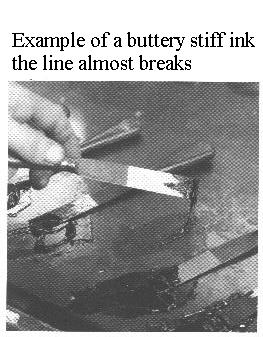 the oil are
rearranged into "chains". This process is called polymerisation.
Viscosity increases with the length of the boiling time. A "buttery"
ink has been made of a varnish thas was boiled a short time and with
a lesser viscosity. A "stringy" ink has been made with a varnish that
was boiled a longer time , with a higher viscosity. In general one
can say that wiping off a plate is easier with buttery ink than with
stringy ink. The latter leaves some marks. (see pictures). This
however not true for every ink. There are inks that are stringy but
yet easy to wipe off. This might be accomplished with some additions.
(Often secret)
the oil are
rearranged into "chains". This process is called polymerisation.
Viscosity increases with the length of the boiling time. A "buttery"
ink has been made of a varnish thas was boiled a short time and with
a lesser viscosity. A "stringy" ink has been made with a varnish that
was boiled a longer time , with a higher viscosity. In general one
can say that wiping off a plate is easier with buttery ink than with
stringy ink. The latter leaves some marks. (see pictures). This
however not true for every ink. There are inks that are stringy but
yet easy to wipe off. This might be accomplished with some additions.
(Often secret)
The sort of pigment added to the varnish determines
also the character of an ink. One ink can be rubbed into varnish
easier than another. In general one can say, the more the varnish is
saturated with pigment the stiffer the ink is. A saturated ink has a
better covering power than a lesser saturated ink. The covering power
also depends upon the magnitude of the pigment grains. A fine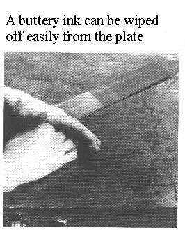 pigment gives a better covering
than a coarse pigment.
pigment gives a better covering
than a coarse pigment.
The differences in inks can also be caused by additions like inkconditioners and fillers. The most important reason that inks differ however lies with the printer. In the hands of one printer a specific ink is like shoe polish, while another printer thinks it is the best ink available. All these differences have not been investigated in this survey. Neither has been investigated which ink gives the best print results. This would generate too much data and would therefore not improve the insight in the matter.
An aquatint plate can be wiped clean with any of the inks discussed here. One gives a little bit more trouble than the other, or with use of additions. A deep line etching or dry point demands however specific properties regarding the stiffness of the ink.
Several plates were inked, without any additions, at
a temperature of 40 - 50 °C. One plate was a dry point, two others
had a coarse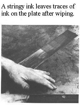 line etching
and a finer one, four plates had an aquatint. The plates with dry
point and line etchings were wiped off with tarlatan. The aquatints
have been wiped by hand and some chalk powder. A sample of the ink
was brought onto a sheet op paper (250 gr. Velin Arches) , which
shows after a while the seperation of the ink and the oil, or to say
it differently, how much the ink "shows through". An ink thar shows
through will, in the end, damage the paper. Finally small towerlike
shapes were made to judge the smoothyness of the ink. Such a shape is
made by lifting the spatula slowly from the inking stone. Between the
inking stone and the ink on the spatula a thin line is formed. The
dripping ink fals back to the stone and forms a small "tower shape".
The longer the line is, the stringier the ink is. With a stiff ink
the tower shape will keep standing upwards for a longer time. Since
every artists has his own demands with respect to printing inks, a
ranking in quality can not be done objectively. This survey therefore
gives no judgements about quality of the inks.
line etching
and a finer one, four plates had an aquatint. The plates with dry
point and line etchings were wiped off with tarlatan. The aquatints
have been wiped by hand and some chalk powder. A sample of the ink
was brought onto a sheet op paper (250 gr. Velin Arches) , which
shows after a while the seperation of the ink and the oil, or to say
it differently, how much the ink "shows through". An ink thar shows
through will, in the end, damage the paper. Finally small towerlike
shapes were made to judge the smoothyness of the ink. Such a shape is
made by lifting the spatula slowly from the inking stone. Between the
inking stone and the ink on the spatula a thin line is formed. The
dripping ink fals back to the stone and forms a small "tower shape".
The longer the line is, the stringier the ink is. With a stiff ink
the tower shape will keep standing upwards for a longer time. Since
every artists has his own demands with respect to printing inks, a
ranking in quality can not be done objectively. This survey therefore
gives no judgements about quality of the inks.
Back to Main Page of the
"Printmaking dictionary"
![]()